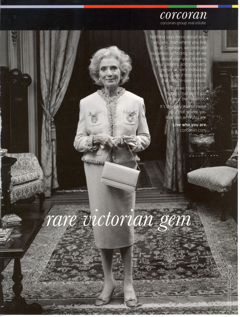
Corcoran Live Who You Are Rebranding Campaign
The largest residential real estate firm in New York City, The Corcoran Group wanted to differentiate from the crowd by rebranding themselves to focus less on properties and more on individuals. I thought of my mother and how much her Long Island Colonial Georgian-style home was a reflection of her personality. Richard Avedon's black-and-white photographic portraits also came to mind. From these seeds, the Live Who You Are campaign grew, showcasing individuals front and center with aspirational copy that stressed Corcoran's goal to match people with properties that expressed their character, dreams and desires. Throughout, I used the headlines to play on familiar real estate jargon. Rather than using stock images, Corcoran hired famed portrait photographer Tina Barney.
This is a sampling of print ads that also appeared as billboards and bus stop placards. It was a thrill seeing my work on public display.
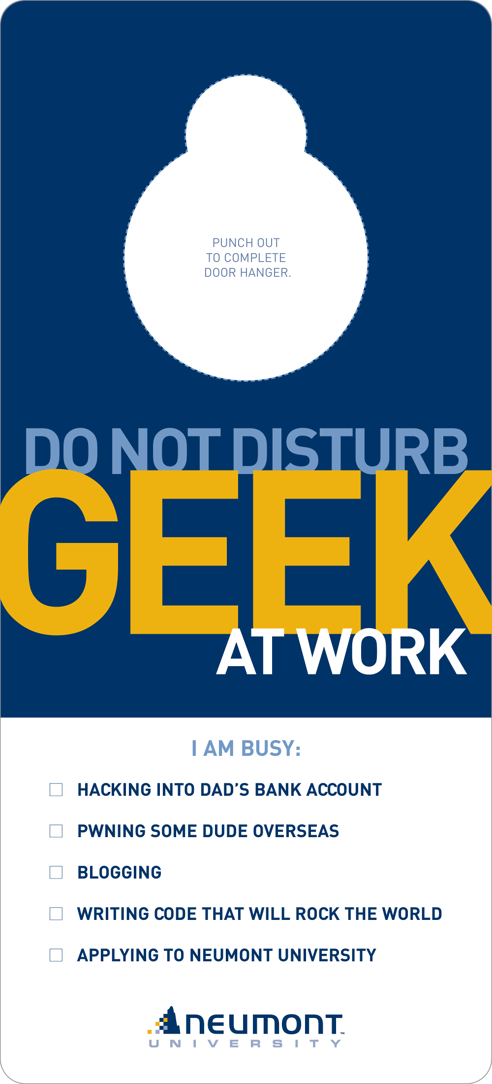
Neumont University Doorhanger Enrollment Driver
Located in South Jordan, Utah, Neumont University offers students an accelerated, two-year Bachelor's Degree program in computer science. They had a superb reputation and rigorous academic standards, but their enrollment numbers were dwindling. The control at the time was a standard #10 letter package but they wanted something that would float to the top amongst the flood of college literature all high school juniors and seniors receive.
Knowing next to nothing about computer science, I immersed myself in student culture. I eavesdropped on campus and monitored the student-run community blog. These people prided themselves on being "geeks." A great weekend for them was undisturbed hours of playing World of Warcraft and writing code. I thought of a hotel "DO NOT DISTURB" sign and this die-cut piece came to life. I used geek terms like "pwning" to appeal to the audience without seeming like a poser and stressed the intense curriculum at the school. The client was scared of the whole idea (naturally), so they tested it against the control with an A/B split. It trounced the control and boosted admission applications by over 30%. Perhaps my biggest satisfaction, though, was seeing the doorhanger posted in the cubicles of programmers at work.
After the success of this effort, Neumont underwent a design rebranding but retained and asked me to enhance the messaging and attitude that struck a chord here. I've included some DM samples of that behind this piece. I also drafted their website.
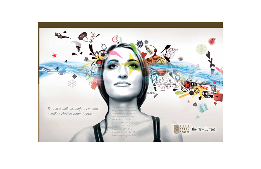
City Creek Center The New Current Launch Campaign
This is a campaign I worked on for the launch of City Creek Center in Salt Lake City. Open since March 2012, City Creek is an upscale retail, dining, office and residential complex built in an effort to revitalize the nearly barren downtown area. A key feature of the center is a 1,200-foot long re-creation of the south fork of City Creek—the waterway that once coursed through Salt Lake. I focused on that to build my concepts and came up with the tagline “The New Current.” Using flowing water in the imagery, I wanted to convey the idea of something new and exciting rushing in, teeming with treasures. I also wanted to showcase individuals and what objects of desire they might have in mind.
I drew a rough sketch and my AD worked his magic to develop the concept far better than I had envisioned. The clients loved the whole “feel” of it and were pleased that we even managed to include the names of some of the retailers in the image. Behind these, I’ve included other concepts we presented.
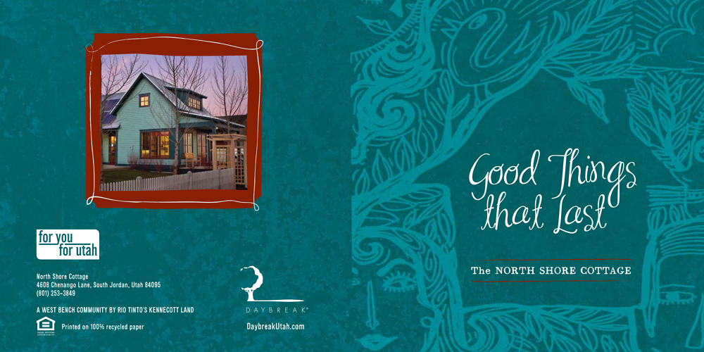
Daybreak Utah North Shore Cottage Brochure
Daybreak Utah, a residential community focused on sustainability, wanted an informational brochure to demonstrate the eco-friendly nature of their homes. This could have been a yawn-inducing subject, but I decided to tackle it with a breezy, casual tone. The client originally wanted photos, but I convinced them to pair me with Joe Esquibel, a local illustrator and friend, because I knew his whimsical style would perfectly complement the text. The result? An informational piece that's not only easy to digest but fun to look at.
There's another brochure for Daybreak below where I used the same conversational tone that I also carried through when crafting the website copy.
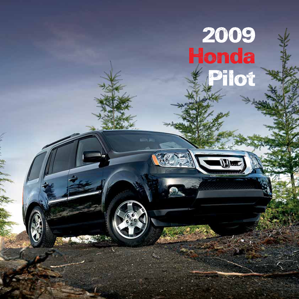
Honda Pilot Launch Brochure
Honda wanted to launch the 2009 Pilot as a family-friendly vehicle, jam-packed with features and a new lift-up glass hatch. This brochure was targeted at current Honda owners and lessees. I had to work with the assets Honda provided, so the copy was photo-driven and straightforward, all in the Honda tone. What’s not shown here is the envelope. To highlight the new hatch, the back of the envelope was a full-bleed photo of the Pilot’s rear with the flap die-cut to simulate the hatchback. Pretty cool.
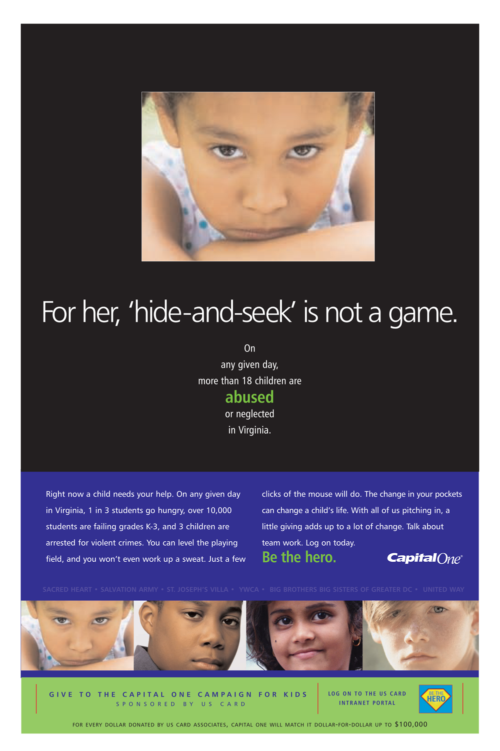
Capital One Campaign for Kids
An art director I used to work with called me one day and asked for my help creating a children’s charity promotional campaign for Capital One in Virginia, where she worked. There wasn’t much of a budget to play with, so we decided on stock photos. Since the campaign was regional, I did some research on children’s welfare in Virginia. I then came up with the “kid games” concept, using that to build the headlines with the harsh statistics underneath to drive the message home. We presented two other concepts, but this was the clear winner with the client, and a success with the public, too.
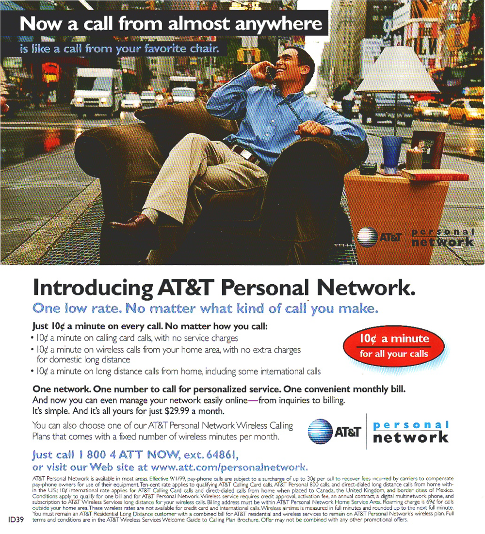
AT&T Buckslips
Two AT&T buckslips—one big budget, one low budget. I was working for Digitas in Boston at the time, and AT&T was one of our biggest clients. The “favorite chair” concept came to me, well, while sitting in my favorite chair in my apartment. What if I was on the phone in my favorite chair—but it was in the middle of the street? It was a dramatic way to illustrate the freedom and flexibility of AT&T’s Personal Network. I doubted the client would go for it, though, since it involved a photo shoot—on the streets of New York, no less. But they loved it. The second buckslip, Summer Essentials, promoted AT&T’s Calling Card. Stock images were used there.
Letter Samples
Sales letter writing, especially these days, is a lost art. Social media may be the current “big thing,” but we still need to make a genuine connection with our audience, no matter what the medium. When tasked with writing a letter, I try to give it a personal spin if I can to make it sound less like it came from a faceless corporate hack. I also have to sell myself on something first before I can persuade anyone else to believe in it. If you don't truly buy into a product or service, that's going to come across in your copy.
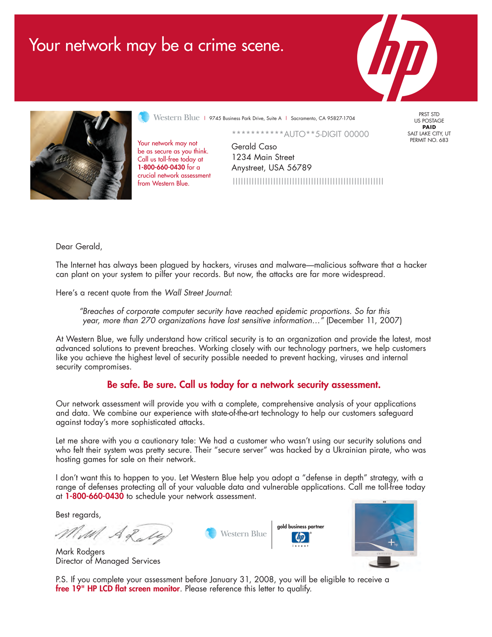
Rather than a showcase of a specific letter or DM package, here’s a sampling from a variety of clients—HP, Acura, AT&T, Prudential, American Century, American Express and Doubleday. These are only the letters; I did not include brochures, envelopes or BRCs.
I’m particularly fond of the letter on page 10, which was never actually mailed. Doubleday wanted to gauge consumer interest in a Catholic book club and the letter was part of a DM test package presented to focus groups. Participants had a strong reaction to the letter, wanting to know who Mark Turner was and what happened to his son. Of course, Mr. Turner didn’t exist. I made up him and his story and his picture is a Photoshopped Walter Cronkite. The focus group leader wasn’t prepared to answer these questions, so he steered the conversation in a different direction. I always keep that story in mind when writing, trying to create something that resonates and rings true.
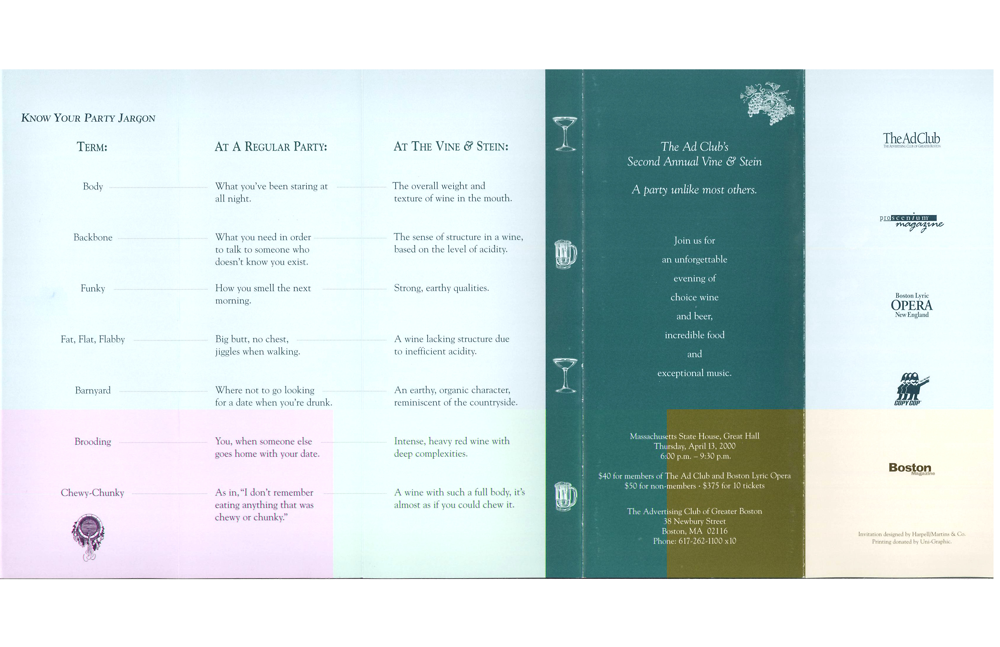
Boston Ad Club Vine & Stein Invitation
This is a fun invitation I did for the Boston Ad Club’s Vine & Stein event. I’m by no means a wine connoisseur, but when I took on the project I immediately thought of the descriptive terms some oenophiles use when tasting wine. I wanted to play off that and also make it clear that this wasn’t just another cocktail party. I had to get inventive with the terms (my favorite is "Chewy-Chunky") to make the concept work. The invite received an overwhelming response and the party was a hit.
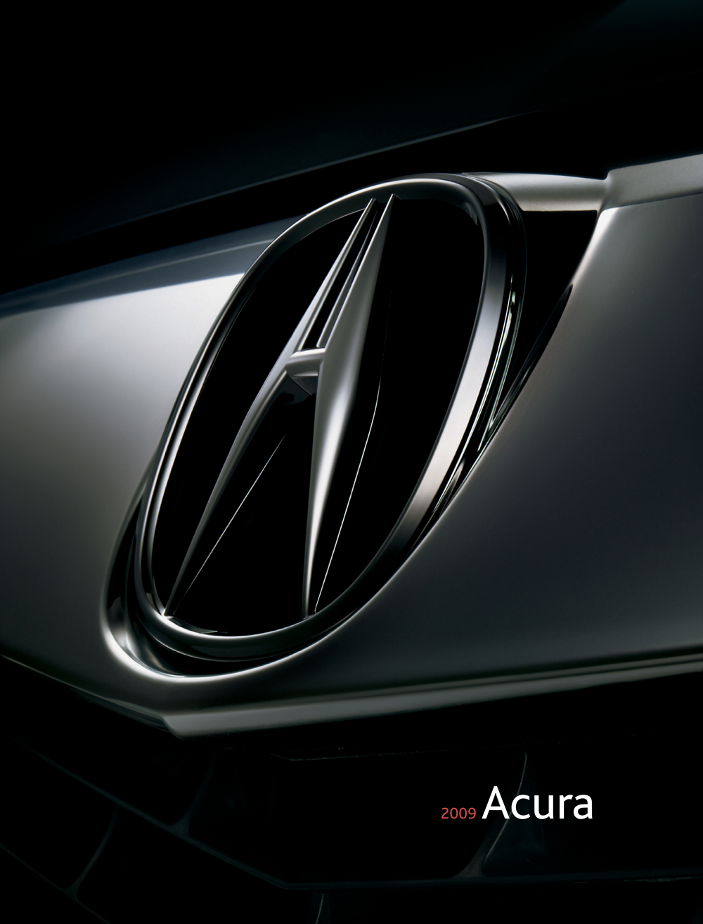
Acura Full Line Off Lease Brochure
Here’s another automotive piece I did while working at Rastar Digital Marketing in Salt Lake City, whose biggest clients at the time were Honda and Acura. This brochure introduced the 2009 Acura lineup to current lessees nearing their expiration. The hardest challenge for me was giving each of the five models a distinct personality. There was no real big concept, other than my idea to include review quotes from industry sources, which had to go through legal. The brochure was mailed with a variable data letter, noting the lessees’ current model, lease expiration date and local dealership. We then spun off this brochure into individual brochures for each model. I was knee deep in Acura footnotes. On top of that, all these pieces had a web component, as well.
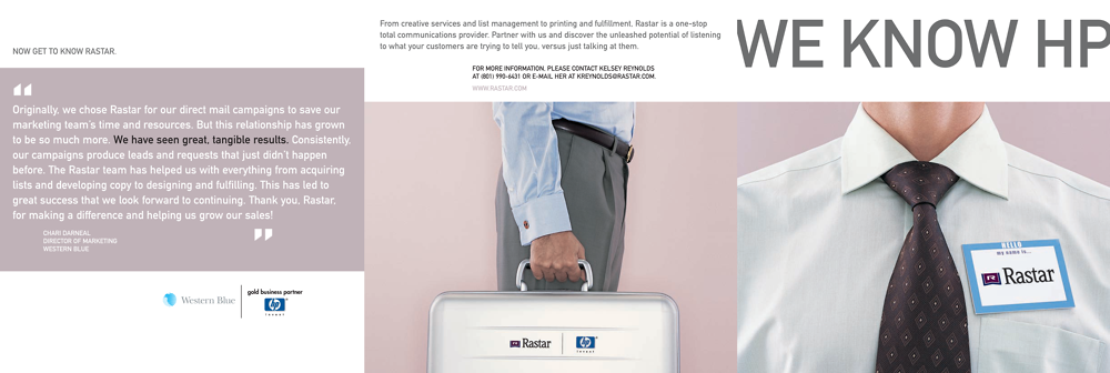
Rastar/HP Capabilities Brochure
Sometimes, you not only have to promote your clients, but also yourselves. At Rastar, another of our big clients was Hewlett-Packard and their reseller partners. This brochure was created as a takeaway and mailer to introduce Rastar’s capabilities to resellers. I decided on the WE KNOW HP theme with a focus on our people, including me. In addition, the piece showcases some of the successful dimensional and die-cut pieces we had created for HP resellers who were already on board.
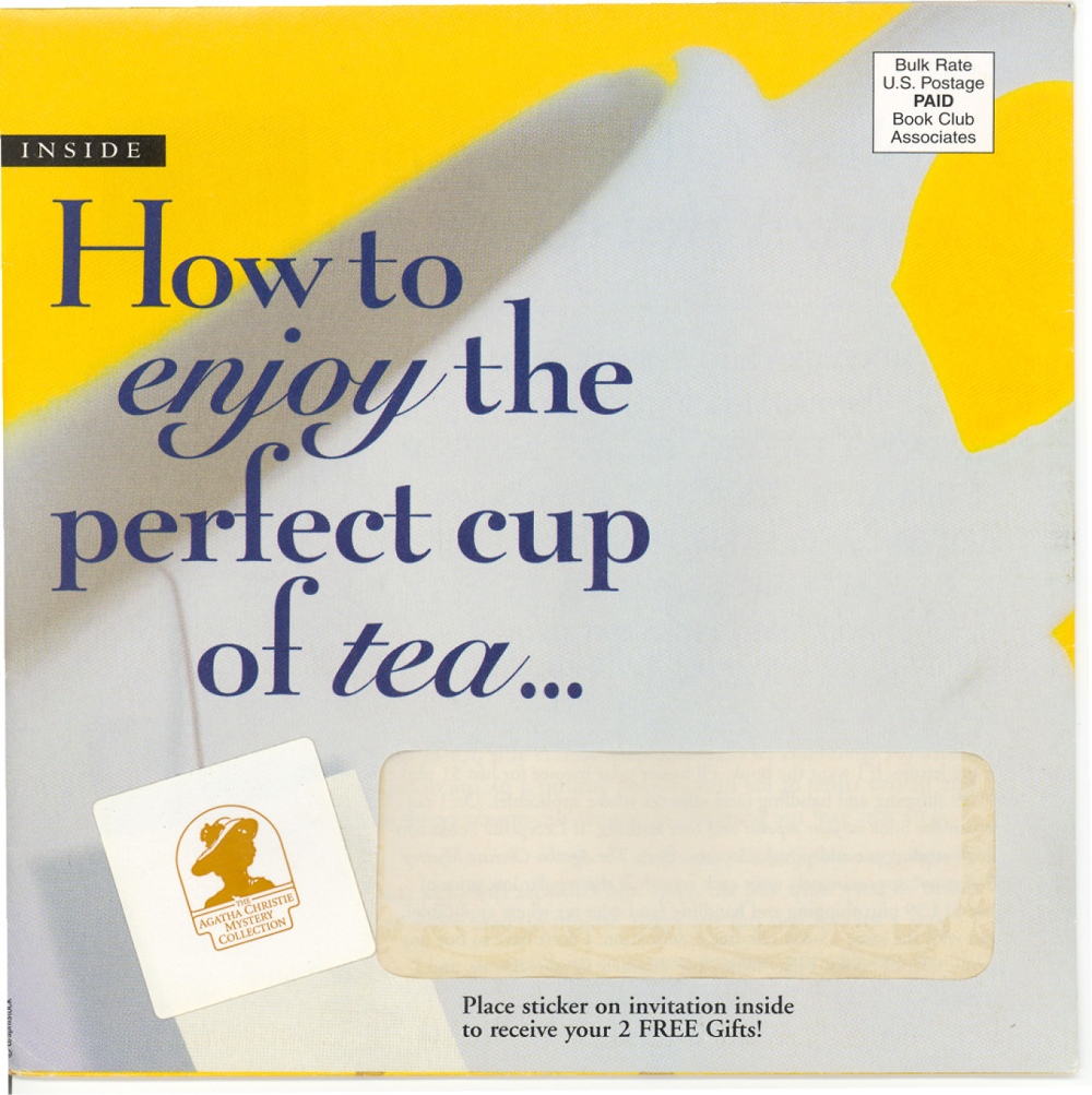
Agatha Christie Mystery Collection Perfect Cup of Tea DM Package
Doubleday inherited a failing Agatha Christie continuities program and I was teamed with an art director to help revive it. I researched and was struck by how popular Christie is even today. She is the best-selling novelist of all time and her works rank third behind Shakespeare and the Bible as the world’s most widely published books. I learned that her mysteries—particularly the Miss Marple books—were known as “cozies,” partly because of their lack of sex and violence. I then thought of a tea cozy and cozying up with a good book. What better way to enjoy Agatha than snuggling up on a rainy day with a cup of tea?
That’s the origin of this DM package which resulted in a 40% lift in response. This is a scan of the envelope, the brochure accordion-fold intro and the lift note. The tea bag tab on the envelope was a sticker you could place on the BRC to receive two free gifts. I like including an interactive element in a DM piece to get the reader involved and that much closer to responding. The circles on the back of the envelope were actually scanned teacup stains. The AD and I wanted to update Agatha’s image, so we chose a photo of her as a young woman. In the lift note, I added a personal touch with my aunt’s recipe for tea scones. She ran a tea room on Long Island and, yes, her name is Aunt Kitty. Doubleday paid her $200.00. She was thrilled.
Daybreak Community Brochure
Daybreak received a lot of positive feedback from the North Shore Cottage brochure (above), so they contacted me again to create a brochure describing what it’s like to live at Daybreak and what makes the community so unique.
To get a feel for the place, I took a walk through the neighborhoods with a friend and former coworker and her dog. This became the inspiration for the Tuesday in the park with Dog section (page 5). I wanted a real casual feel, so the copy was handwritten, complete with cross outs. I emulated the whimsical tone from the previous brochure and again used illustrations blended with photos. In words and images, the piece communicates what makes Daybreak special and captures its atmosphere. I used the same tone throughout the website.
Xtreme Tourist: Brazil Episode
8fish was a boutique agency in Sandy, Utah, that specialized in animation/illustration, branding and broadcast production. As the only copywriter on staff, I was expected to write for their TV and radio projects and I jumped at the opportunity. The president, Ernie Harker, launched an adventure-based reality TV show, Xtreme Tourist, with himself cast as the host. Although it was nationally syndicated, you could only catch it if you were channel surfing at 3 a.m., somewhere between infomercials.
We aired eight episodes before shutting down production due to lack of sponsorship. The budget didn’t allow for me to travel on location, so I had to generate all the scripts solely from research and Ernie’s notes while watching a rough edit of the footage. It was a daunting task at first, but it got a lot easier once I had Ernie’s voice in my head and was able to mimic his speaking manner in my scripts. This is most of the Brazil episode. You can watch the rest of it on my YouTube channel.
[Side note: We were in desperate need of free music to use in Xtreme Tourist and the other show we produced, Maverik’s Kick Start. I put the word out on Facebook and Twitter and also bombarded local entertainment, music and college blogs with postings. In return, I was flooded with CDs from area bands and musicians who got a mention in the credits.]
StrongerMarriage.org OURS Commercial
This is one of two commercials I conceived and wrote for StrongerMarriage.org, a website run by the Utah Commission on Marriage that offered resources to help couples form and sustain a healthy and enduring relationship. Originally, I had thought of building blocks, which morphed into letter blocks and words, then finally a couple transforming words together. The spots aired on local stations. The last I heard, they were still running this campaign. You can see the second commercial, WE, on my YouTube channel.

Neways Toxic Rain Animation
Based in Utah, Neways is a network marketing company that manufactures and distributes a line of quality, safety-conscious products. They wanted an animation to post on their website that expressed their values. The animator and I brainstormed the scenario of a woman caught in harsh weather conditions, with a Neways umbrella protecting her from the elements. Since I’m all about words, I thought of the rain transforming into the names of toxins. It got the message across.
Animated Steampunk Commercial: Subatomic Creative Director Ego Minimizer
8fish was a prominent sponsor at the 2009 Utah ADDY Awards. To showcase the winners, we produced an hour-long video presentation interspersed with these animated commercials featuring imaginary, steampunk-themed inventions designed to help those in the advertising industry. The theme had already been decided on before I joined the creative team, and I knew little about the steampunk aesthetic. I had to learn quickly and dream up nine of these inventions.
I had a snake oil salesman’s voice in my head while I wrote the script and the voiceover talent, Chris Miller, perfectly emulated that tone. The presentation was enthusiastically received. Two inside jokes in the script: Steve Whittier, who was one of the judges, is bald and Richter 7 was a local high-and-mighty ad agency.
You can see the other steampunk interstitials on my YouTube channel.
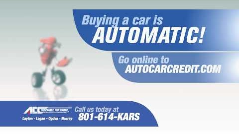
Automatic Car Credit Rappin’ Robot Commercial
At 8fish, I created and scripted a successful campaign for local car dealership Bountiful Mazda, but it was my spots for Automatic Car Credit that still ring in my ears. ACC is a Utah-based used car franchise, catering to customers with less than stellar credit. They approached 8fish to create a brand identity and TV/radio campaign. There was little direction, other than they wanted something “fun and memorable.” I brainstormed several ideas, one of which was this rappin’ robot mascot, Auto. The client loved it and our animators brought Auto to life in several different incarnations before the client settled on this guy.
OK, so I’m no Eminem, but this commercial and radio spot ran locally for months and everyone I spoke to was aware of it. The response was usually something like, “That was you?” I was never quite sure how to take that. Regardless, the client is still sticking by Auto so he must be doing right by them.
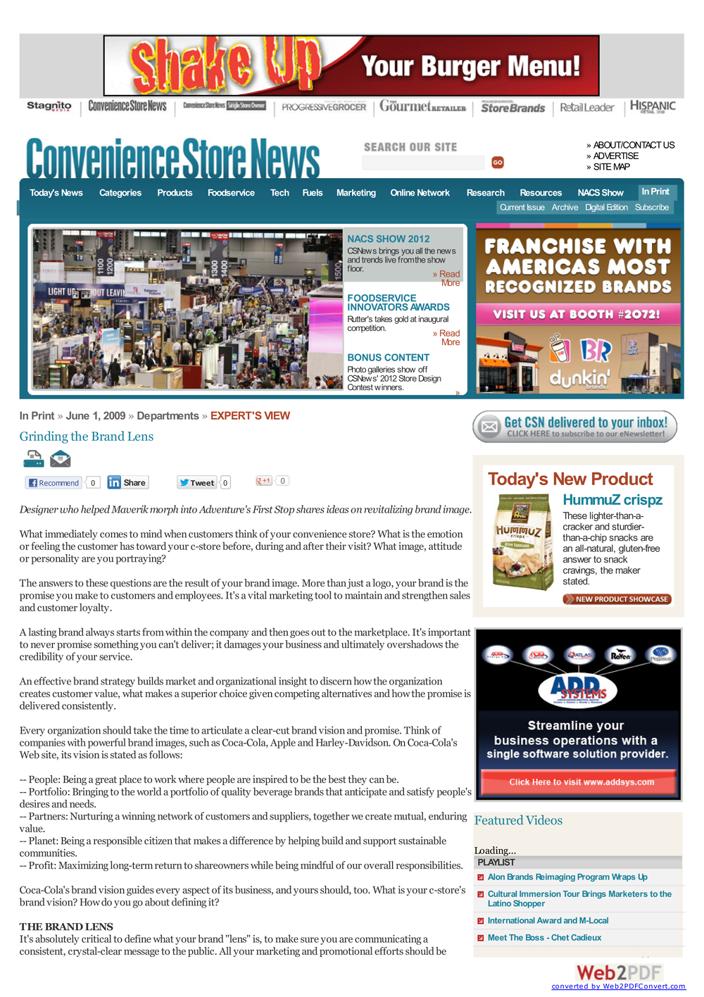
Convenience Store News Grinding the Brand Lens Article
Our biggest client at 8fish was Maverik, a western convenience store chain with over 200 stores in seven states. 8fish had not only transformed their brand with fantastic results, but we also produced their adventure reality show, Kick Start. Maverik was the first and only convenience store chain in the country to have their own TV show.
I was in charge of spreading the word about our work for Maverik, mostly through press releases. I suggested to Ernie Harker, 8fish’s President, that we write an article on branding for Convenience Store News, the leading trade publication. He was all for it, so I contacted Don Longo, the Editor-in-Chief, who was eager for the content but, understandably, didn’t want the piece to overly promote 8fish. I ghostwrote the article for Ernie and, even with a soft sell, it generated some solid leads for us.
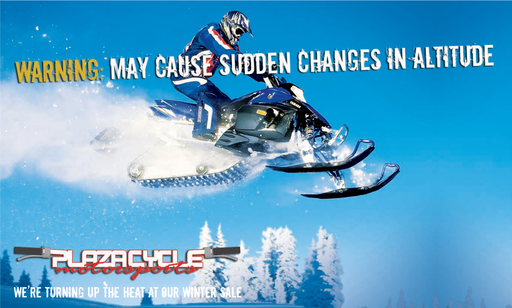
Plaza Cycle Billboards
I’ve had freelance stretches during my career, but the autonomy that allows is never as satisfying as being part of a team. As a writer-for-hire, you take on a job, give it your best and often never hear about it again. Take a look at these two billboards for Plaza Cycle. I worked on the project, got paid and forgot about it. Weeks later, I almost caused an accident while I was driving on the highway and suddenly spotted the GOOSEBUMPS billboard looming up ahead. It was exciting, but until then, I didn't even know what concept the client had picked.
Here’s a sampling of my work, from print to video. If you have something particular in mind and don't see it, ask me. I’ve probably done it. Enjoy the sights!
“A good advertising writer is a very competitive person—a ‘killer poet.’ He wants to win with his art.”—William Bernbach